Overview
PTC (Private Translation Cloud) is a SaaS platform designed for managing complex, large-scale translation workflows. Billing is directly tied to usage, team structure, and subscription limits, making it a critical part of the product experience.
This project focused on redesigning the billing and payment system to improve clarity, reduce friction, and support a wide range of subscription states. The goal was to create an experience that users can understand instantly and trust when making decisions about their plan.
My role
- UX strategy and flows
- UI design and component system
- State definition and behavior mapping
- Interaction design
- Collaboration with product and development teams
The Challenge
Billing is one of the most sensitive areas of any product. Users expect clarity, predictability, and control.
The existing experience had several issues:
- Plan status was not immediately clear
- Different billing states were inconsistently communicated
- Payment history lacked strong hierarchy and scannability
- Editing billing details introduced unnecessary friction
- Edge cases like trial expiration or pending cancellation were unclear
This created uncertainty at key moments where users needed confidence.
Approach
Instead of thinking in terms of pages, I approached this as a state-driven system.
Every billing scenario needed to answer three questions instantly:
- What is my current status
- What does it mean for my account
- What can I do next
From there, the work focused on defining all possible states and designing a consistent way to communicate each one.
Designing the System
1. Plan Card as the Source of Truth
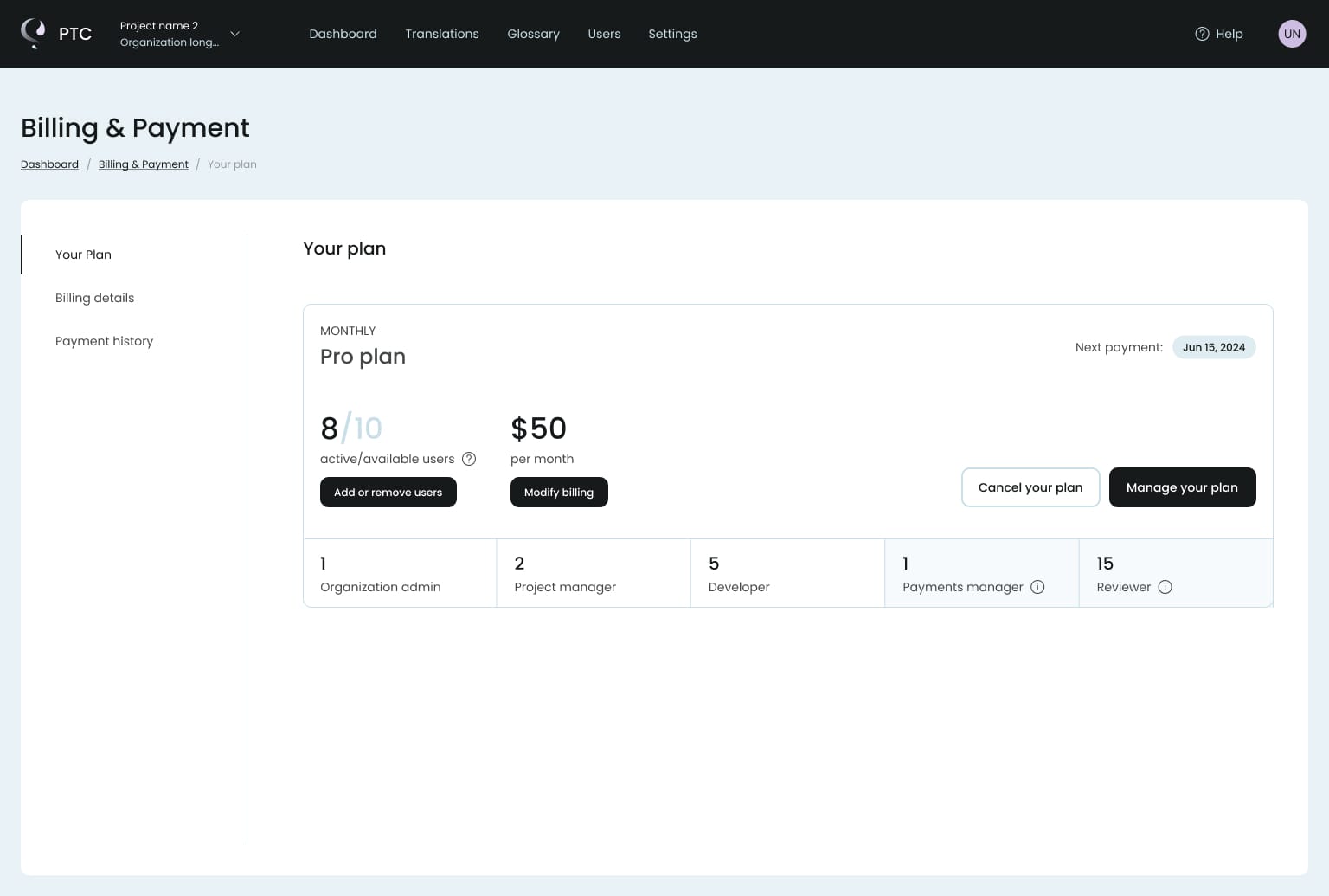
The plan card became the central element of the experience.
It provides:
- current plan and pricing
- number of active users
- renewal information
- clear primary actions
This allows users to understand their situation without scanning the entire page.
2. Clear State Communication
One of the most important parts of this project was defining and designing billing states:
- Active plan
- Pending cancellation
- Trial expired
- Read-only access
- Overdue payment
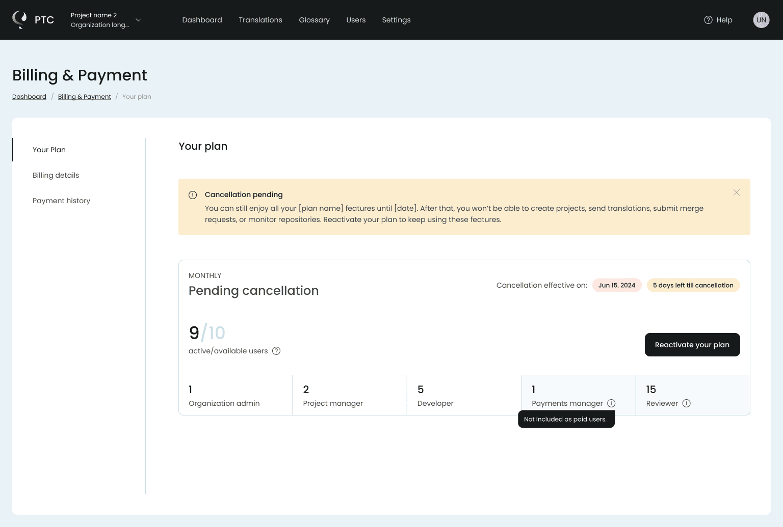
Each state uses a combination of:
- visual hierarchy
- color and badges
- contextual messaging
The goal was to remove ambiguity and make each state instantly recognizable.
3. Action-Oriented Design
Every state includes a clear next step.
Examples:
- Reactivate plan
- Upgrade subscription
- Manage billing
- Resolve payment issues
Instead of leaving users unsure what to do, the interface always guides them forward.
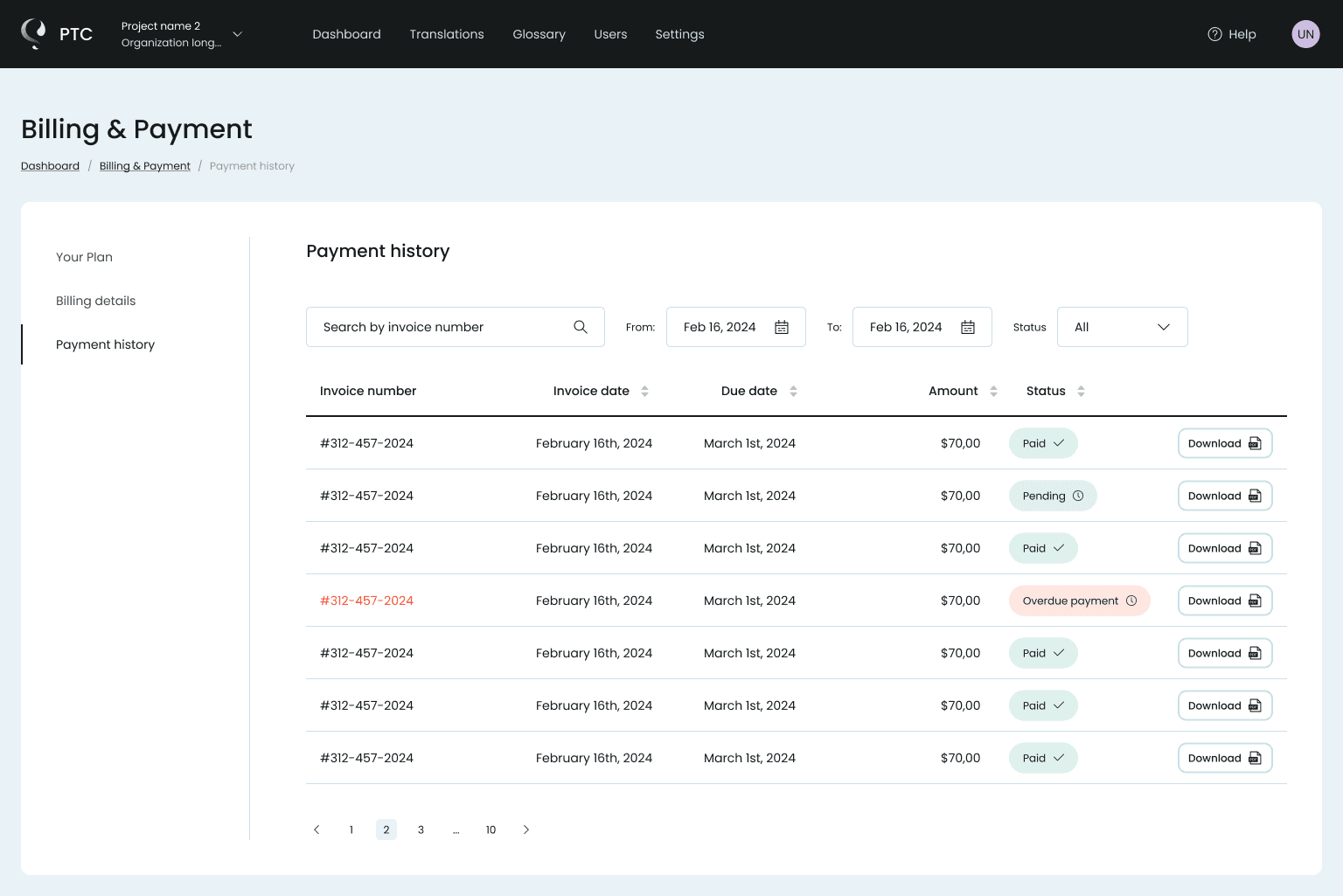
4. Payment History Optimization
The payment history table was redesigned for clarity and speed.
Key improvements:
- strong visual hierarchy across columns
- clear status indicators
- consistent formatting for dates and amounts
- immediate access to invoice downloads
This allows users to scan and act without effort.
5. Progressive Disclosure in Billing Details
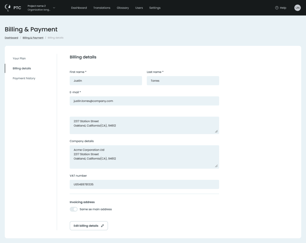
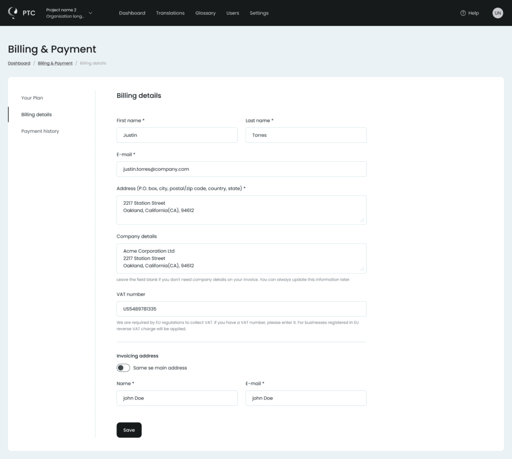
Billing details were split into two modes:
- Read-only view for quick reference
- Edit mode for making changes
This reduces cognitive load and avoids overwhelming the user with input fields.
6. Handling Edge Cases
A major part of the work involved designing for non-ideal scenarios:
- countdown for pending cancellation
- limited access after trial expiration
- overdue payment states
- restricted functionality when billing fails
These states are often overlooked, but they are where confusion and frustration usually happen.
Designing them properly improves the overall trust in the product.
UI Design Principles
The UI was built around a few key principles:
- Clean, structured layouts with strong alignment
- Subtle use of color to communicate status
- Clear typography hierarchy for fast scanning
- Consistent spacing and component behavior
- Minimal distractions in a data-heavy environment
The goal was to make complex information feel simple and controlled.
Key UX Decisions
1. Design for states, not screens
Billing is driven by subscription states, not page layouts.
2. Make the plan the source of truth
One place to understand status, limits, pricing, and actions.
3. Communicate status instantly
Clear visual signals remove ambiguity at a glance.
4. Always provide a next step
Every state guides the user toward a clear action.
5. Prioritize scannability
Data is structured for fast reading and quick decisions.
6. Separate viewing from editing
Keep things simple by default, expand only when needed.
7. Treat edge cases as core flows
Cancellation, trial expiry, and payment issues are fully designed experiences.