The Advanced Translation Editor (ATE)
The Advanced Translation Editor (ATE) is where translation actually happens in WPML. It is used daily by translators, content managers, and teams working across multiple languages.
The previous version of the editor was powerful but difficult to use at scale. It relied on a multi-column layout, scattered controls, and unclear interaction patterns that slowed down both manual and assisted translation.
The goal of this redesign was to simplify the editing experience without reducing capability, making translation faster, clearer, and more predictable.
My role covered UX and UI design, including an early React prototype to validate the new interaction model with stakeholders before development.
The Problem
The original editor had several structural issues:
- Three-column layout created friction
Users had to constantly scan between original, translation, and metadata. - Segment-based editing felt disconnected
Each segment behaved like an isolated unit, without a clear sense of flow. - Overloaded interface
Features like glossary, formatting, links, and AI suggestions were present but not integrated. - High mental effort for simple tasks
Even basic editing required multiple interactions and context switching.
The Approach
Instead of improving individual components, the redesign focused on one core idea: Translation should feel like editing content, not managing segments.
To validate this shift early, I created a React prototype that demonstrated:
- A new single-focus editing model
- Inline interactions for formatting and links
- Contextual surfaces for glossary and suggestions
This helped stakeholders understand the experience before committing to implementation.
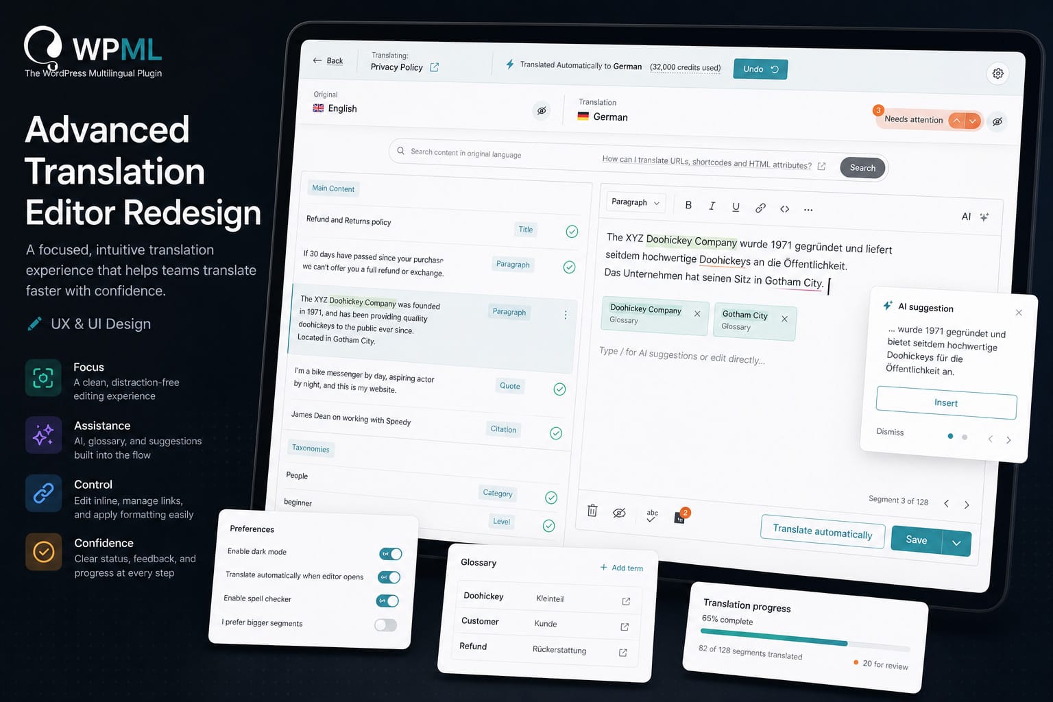
A focused, two-pane editing model
The editor was restructured into a cleaner layout:
- Original content on the left
- Active translation on the right
- Context appears only when needed
This reduces eye movement and creates a clear working area.
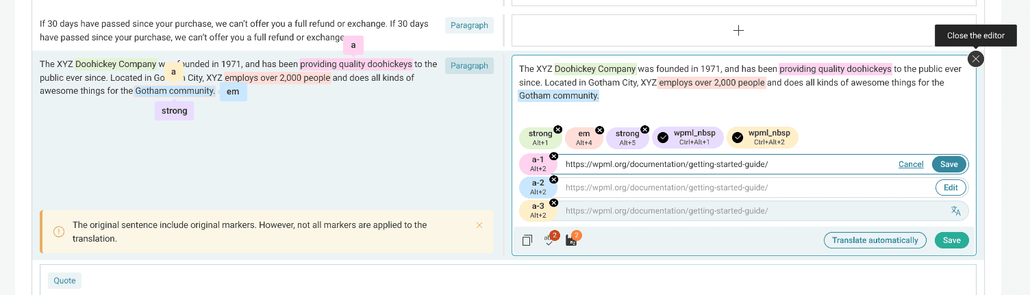
Inline editing instead of scattered controls
Editing actions are now directly tied to the content:
- Formatting appears within the active segment
- Links can be edited in place
- Actions like save or translate are contextual
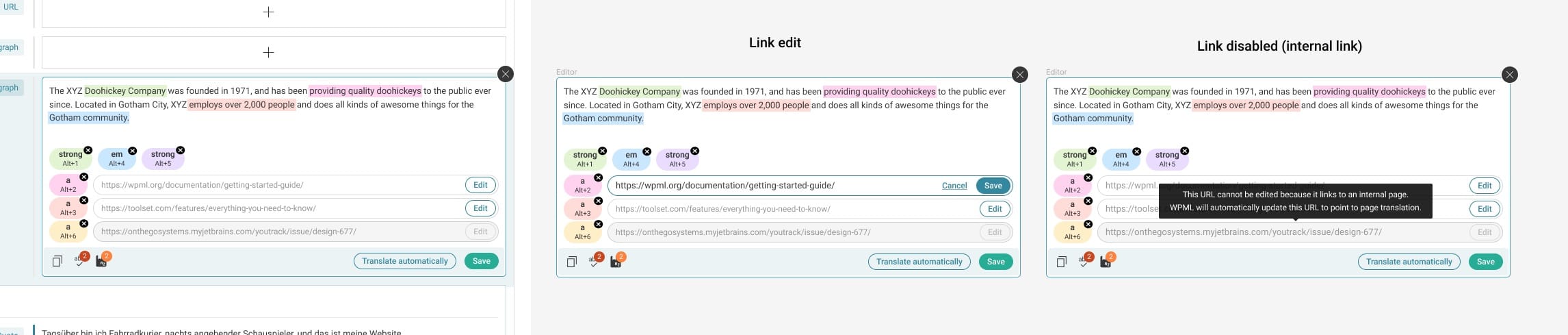
Users no longer need to search for tools.
Integrated AI and assistance
Instead of separate systems, assistance is embedded into the workflow:
- Automatic translation is available per segment
- Spellcheck and suggestions appear inline
- Glossary terms are surfaced exactly when needed
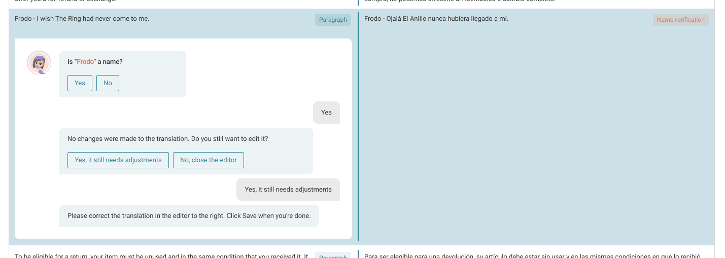
This makes assistance feel like part of editing, not an external tool.
Clear feedback and status
Users always know what is happening:
- Segment status is visible and understandable
- Warnings and notices are contextual
- Progress is clearly tracked
This reduces uncertainty during long translation sessions.
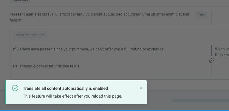
Flexible preferences without clutter
Advanced options are still available but moved out of the main flow:
- Personal preferences like dark mode or segment size
- Automation settings and AI assistant toggles
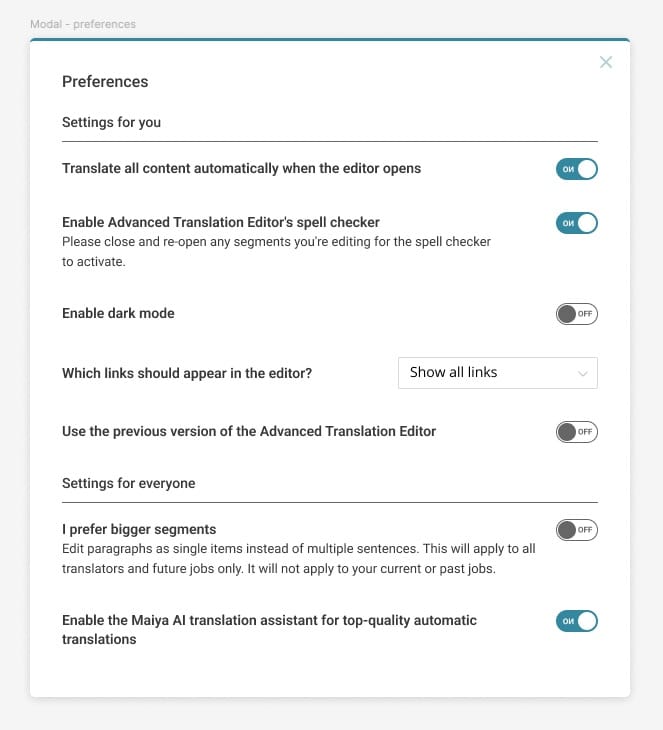
Power users keep control, without overwhelming everyone else.
04 — outcomeA more natural process
The redesigned editor transforms translation into a more natural process.
Users can now:
- Focus on one segment at a time without losing context
- Edit faster with inline tools and fewer clicks
- Trust automation while staying in control
- Work comfortably even on large, complex content
The experience feels closer to writing and editing, and less like managing a system.
Key UX Decisions
Replace multi-column complexity with focus
Move from three competing columns to a clear working area.
Bring tools to the content
Make editing actions appear where users are already working.
Integrate assistance into the flow
AI, glossary, and suggestions should support, not interrupt.
Reduce context switching
Keep users in one place instead of jumping between panels.
Prototype the experience early
Use a React prototype to validate interaction before development.